Dashboard
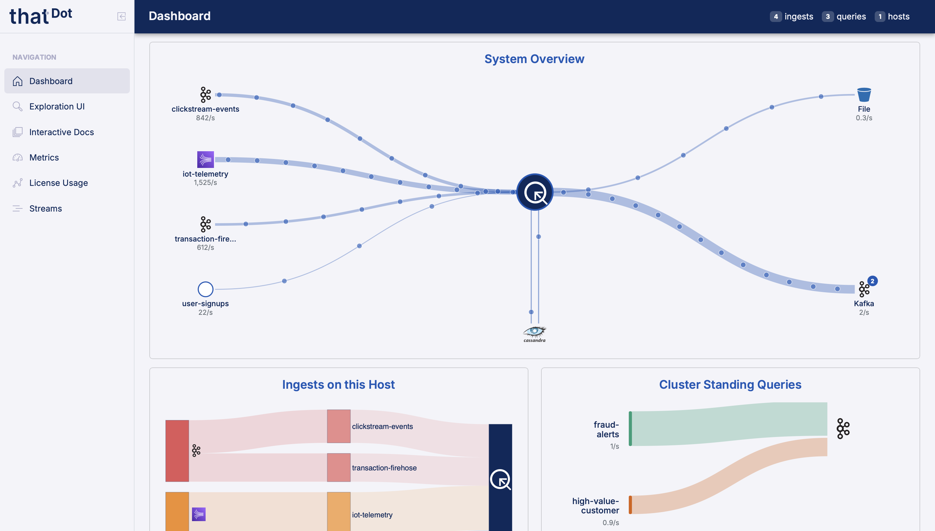
The Quine Enterprise dashboard is the landing page you see when you first open the UI. It shows a live flow diagram of your data pipeline, from ingest sources through the graph to standing query outputs, so you can see at a glance whether data is moving and where it is slowing down.
A summary bar in the page header shows live counts of active ingests, standing queries, and cluster hosts. Hovering over those badges gives a quick status breakdown.
Status bar
The bar across the top of the flow diagram summarizes the state of the whole pipeline:
- System Status: the overall state of the pipeline, one of Flowing, Backpressured, Stopped, or No Data.
- Throughput: current events per second moving through the system.
- Bottleneck: the stage currently limiting throughput, if any. This compartment is hidden when viewing cluster-wide aggregates, since a bottleneck is a per-member property.
- Global Ingest Valve: whether the global valve is open, and how often it closed over the last minute. The valve is Quine Enterprise's internal mechanism for pausing ingest when downstream stages cannot keep up.
- Update: the diagram refreshes every 5 seconds. Use the pause button to freeze it while you inspect a state.
Flow diagram
The diagram lays the pipeline out in stages, left to right: Ingest Source, Global Valve, Graph & Persistor, Standing Query Results, and Standing Query Outputs. Each ingest stream, standing query, and output workflow appears by name, and the persistor card shows the database type (for example RocksDB or Cassandra) along with live read and write latency.
Animated flow lines connect the stages. Line width tracks events per second, and color tracks each stage's state: green for flowing, yellow for constrained, amber for backpressured, and red for stopped. When one stage is holding everything else back, the diagram marks it as the bottleneck.
Scope: cluster and members
On a multi-member cluster, a chip row above the diagram selects the scope. The Cluster chip shows aggregate flow across all members, and the numbered Member chips narrow the diagram to a single member. The chip row only appears when the cluster has more than one member.
The All Graphs filter beside the chip row narrows the diagram to a single graph namespace.
Permissions
When authentication is enabled, each dashboard card is gated by RBAC permissions, and users who lack the relevant permission for a card will not see it at all. The flow diagram requires ApplicationMetricsRead, Host Metrics requires ApplicationMetricsRead and ShardLimitsRead, Cluster Status requires ClusterStatusRead, and License Usage requires LicenseRead.
Cards below the diagram
Cluster Status: the cluster's target size, an overall badge (for example Fully Up), and a table of every member with its role and address.
Host Metrics: heap usage, shard count, and the soft and hard in-memory node limits.
License Usage: current license consumption as a percentage of the monthly limit, the license expiration, when the license was last verified, the licensee, and the environment.
Other pages
The sidebar gives you access to the rest of the UI:
-
Exploration UI (
/explorer): interactive graph query and visualization -
Graphs (
/graphs): create and manage graph namespaces -
Streams (
/streams): create and manage ingest streams and standing queries - Metrics (
/metrics): deeper JVM and shard metrics with histograms -
Interactive Docs (
/docs): interactive OpenAPI docs for the V2 API -
License Usage (
/usage): license consumption over time
When authentication is enabled, sidebar entries are also permission-gated: Exploration UI requires GraphRead, Graphs requires NamespaceRead, Streams requires IngestRead and StandingQueryRead, Metrics requires ApplicationMetricsRead and ShardLimitsRead, Interactive Docs requires InteractiveApiView, and License Usage requires LicenseRead.